Final Formatting of Graphs
Table of Contents
- Formatting the final display of a scatter plot
- Drawing a reference line
Introduction
Most graphs will need to have some additional modification done to its
layout once the basic elements are in place. Excel uses defaults for a
number of parameters and options which, in some cases, will need to be
modified the optimize the display of the data. Remember, the primary goal
is to communicate your results as clearly and concisely as you can.
There are two primary ways of modifying the display of your graph, through
the menu choice Chart>Chart Options... and by clicking once
to highlight an element in the graph and then choosing Format>Selected...
(or by simply double-clicking on the element). Here is a breakdown
of what can be modified with each of these methods:
- Chart Options
- Axes
- Data Labels
- Gridlines
- Legend
- Titles
- Format
- Axis
- Chart area
- Data Series (e.g., points in a scatter plot, lines in a line graph,
bars in a bar graph)
- Plot area
- Title
- Trendline
Note that there is overlap on some elements between the two methods.
In general, the Chart Options control whether an item is displayed or
not (e.g., show values on the Axes) while Format controls the final format
of the element (e.g., font size and text orientation of the axis values).
Also note that the listing of elements under Format does not hold for
all graphs. What can be formatted depends on what elements the graph contains.
In general, double-clicking on an element will get you the Format dialogue
for that element.
What should be modified and how? This will be highly dependent on your
data set and the goals for your graph. You may want to refer to the resource
on revising your visuals
for more advice.
Some modifications are more involved than others. Modification of the
graph axes is one of the more involved options. The Advanced module on
data display goes into more detail about
this option.
Below is an example of a few of modifications that can made to a graph.
Return to Top
Formatting the final display of a scatter plot
The readability and display of the scatter plot below can be further
enhanced by modifying a number of the parameters and options for the chart.
Many of these modifications can be accessed through the Chart menu, the
Chart floating palette, and by double-clicking the element on the chart
itself.
Here is the initial scatter plot with a regression line (Figure 1). Let's
start by creating a better contrast between the data points and regression
line and the background.
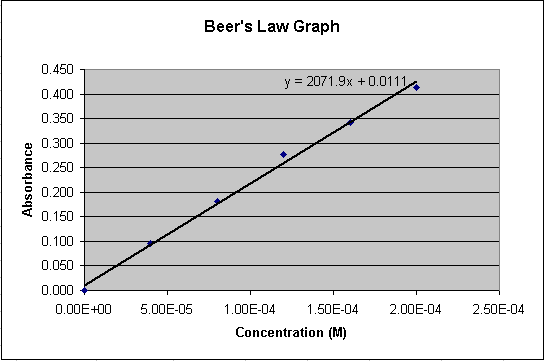
Figure 1.
- Double-click in the gray background area of the graph
or by clicking once to highlight the gray background, and then
choosing Format> Format Plot Area...
In the Chart Area Format dialogue, set the border and background
colors (see Figure 2)
- Choose None for a Border
- Choose the white square from the color palette for an Area
color
- Click OK
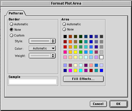
Figure 2.
Now, delete the horizontal grid lines
- Click on the horizontal grid lines in the chart and
press the Delete key (you can also go to Chart>Chart Options
and turn them off under the Gridlines tab).
Now, adjust the color and line weight of the regression line and the
color of the data points
- Double-click on the regression line
- Choose a thinner line for the Line Weight
- Click on the word Automatic next to Line Color and
the color palette appears. Choose dark blue from the color palette
- Click OK
- Double-click on one of the data points
- Choose dark red from the color palette for the Marker Foreground
and Background
- Click OK
Finally, you can move the regression equation to a more central location
on the chart
- Click and drag the regression equation
If necessary, resize the font size for text elements in the graph.
- Either double click the text element or choose it from the
floating palette
- Click on the Fonts tab
- Choose a different font size
The results can be seen in Figure 3.
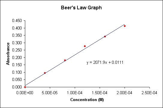
Figure 3.
Return to Top
Drawing a reference line
A titration is when an acid of known concentrtation is added to an unknown
basic solution or vice versa and the change in pH is recorded. This change
in pH vs. the amount of acid or base added can be graphed as a titration
curve. The critical point on this titration curve (Figure 4) is where
it passes through a pH of 7. The amount ofadded acid/base of a known concentration
at a pH of 7 can be used to calculate the concentration of the unkown
solution. The inclusion of a horizontal reference line will help indicate
this point.
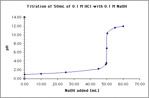
Figure 4.
There is not an existing element associated with the graph to use as
a reference line, so one has to be drawn from scratch using the drawing
tools:
- A set of drawing tools should be visible at the bottom of the window.
If not, click on the Draw icon (Figure 5) two to the right of
the Chart wizard icon.

Figure 5.
- Make sure your chart is highlighted
- Choose the line tool at the bottom of the window (Figure 6):

Figure 6.
- Draw a horizontal line at pH 7 across the width of the chart
by clicking and dragging a line across the chart area.
- With the horizontal line still highlighted, choose a 3/4 pt line
thickness at the bottom of the window (Figure 7):
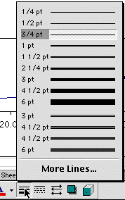
Figure 7.
- and a dashed line type (Figure 8):
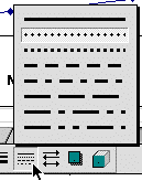
Figure 8.
- Finally, change the color of the line to red to help it stand
out (Figure 9):
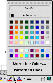
Figure 9.
Your final graph will look like this (Figure 10):
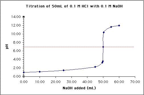
Figure 10.
Return to Top
|