|
Designing Tables
Table of Contents
- Introduction to Tables
- Parts of a Table
- Tabulating Raw Data
- Tabular Presentation of Data
- Types of Tables
- Best Practice
Introduction to Tables
Tables are commonly used in collecting and organizing raw data during an experiment and also
for representing final data to be included in a paper or report. Most raw data are recorded
in tabular form in a spreadsheet, a lab notebook, or a lab manual; but once recorded, data
need to be reorganized, summarized, and reshaped into a final table or graph (see fig. 1).
In some cases, lab experiments will require sketches from observation and may or may not need
a table to go along with them. In most cases you'll be using tables to collect and then
organize your data. Since tables are so important for data management in the science
laboratory, you need to know the basics about designing a table for your data.
The representation of data in a table is formally referred to as tabular presentation.
Tabular presentation of data allows data to be organized for further analysis, allows large
amounts of raw data to be sorted and reorganized in a neat format, and allows the inclusion
of only the most important or relevant data. It also facilitates a dialogue between the text
and the exact numbers in your results, so that you don't have to describe all the specific
numerical values in your report. On the other hand, you should never put data in a table
if you can describe it efficiently in one or two sentences. In summary, tabular presentation
lets you place your results in an organized display of rows and columns that enable you to
group your data by different classifications so that you can make comparisons and better
understand your data.
When using a table as a final representation of data to communicate your results in your report,
list specific data values or draw comparisons between variables by listing subtotals, totals,
averages, percentages, frequencies, statistical results, etc. Tables are not the best choice
when you want to show a trend or relationship between variables. These are best represented
by graphs. Good tables should be easy to read across rows and down columns, easy to understand,
and easy to refer to in the text of your report. They should also include only relevant
data from your results.
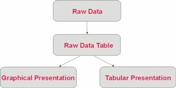
Fig. 1
Return to Top
Parts of a Table
Example 1 : Table with Labels
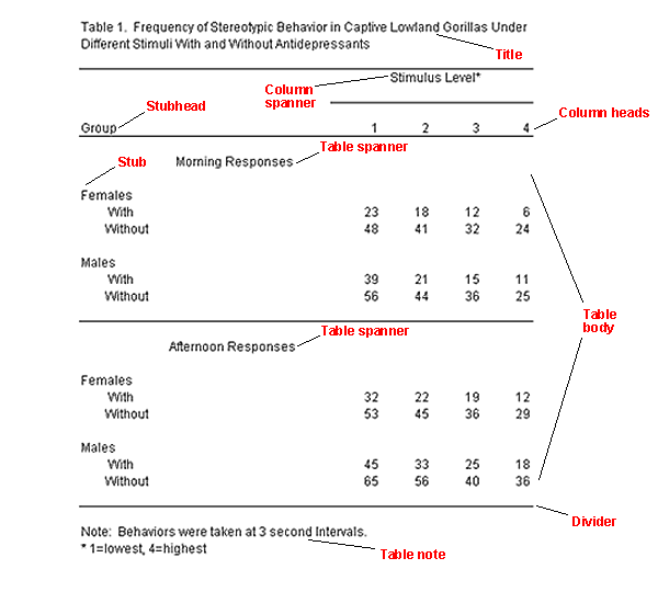
Title: The title provides a brief description of the contents of the table.
It should be concise and include the key elements shown in the table, for example,
groups, classifications, variables, etc. It should never be more than two lines.
Although, there are varying styles for writing a title, most titles should be
underlined or italicized, and the first letter of each word should be capitalized
following the rules for any title, or the entire title can be in caps. Periods are
left out at the end of the title. If the title is two lines long, the lines can
be either single-spaced or double-spaced depending on the style you're using.
Sometimes referred to as the table legend, a table's title should always go
above the table.
Table number: Tables should be numbered in the order that they are referred
to in your report, as Table 1, Table 2, and so on. The table number has a period at
the end and a space to separate it from the title, which normally follows the table number.
Headings & Subheadings: While data form the body of a table, headings and
subheadings allow you to establish an order to the data by identifying columns. They
should be written in the singular form unless they refer to groups, e.g., men, women,
etc., and the first letter of the first word should be capitalized. Headings should be
key words that best describe the columns beneath them. They should not be much longer
than the longest entry in their columns. Example:
- Column Headings: Each column has a heading in order to identify what
data are listed below in a vertical arrangement. When the column heading is above
the leftmost column, it is often referred to as the "stubhead" and the column is
the "stub column." This column usually lists the independent variable. The data
that follow the stub column are known as the "stub." All other column headings
are simply referred to as "column heads." Note that units should be specified
in column headings when applicable.
- Column Spanner: A heading that sits above two or more columns to indicate
a certain classification or grouping of the data in those columns. A column spanner
may also specify units, when appropriate.
Table Body: The actual data in a table occupying the columns, for example, percentages,
frequencies, statistical test results, means, "N" (number of samples), etc.
Table Spanner: A table spanner is located in the body of the table in order to divide
the data in a table without changing the columns. Spanners go the entire length of the table
and are often used to combine two tables into one in order to avoid repetition. A table spanner
may be written in the plural form.
Dividers: Dividers are lines that frame the top and bottom of the table and, or mark
the different parts of a table. They are often used for division or emphasis within the body of a table.
Table Notes: You may use table notes to explain anything in your table that is not
self-explanatory. While basic symbols and abbreviations like SD for standard deviation, N
for sample size, and % for percentage, are commonly used, you may have other technical
terms or other issues that you wish to explain. In these cases, you would place an asterisk
(*) for the first note you need after the specific data value. Then, you would place the
asterisk below the table followed by the note or explanation required for that value. Other
data values requiring notation would get two, three asterisks, or a stacked cross () in
that order. Notes following these additional items would follow the first note using the
same format. Notes that apply to the table in general should be listed after the word
"Note: " under the table.
Return to Top
Tabulating Raw Data
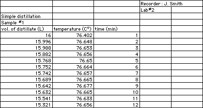
When you are collecting data during a laboratory experiment, it is important that you record it
in tabular format in a spreadsheet, lab manual, lab notebook, or word processing software. Your
raw data table should include all the data you collected during an experiment as well as all
necessary calculations.
Whether the final version of your data representation is a table or a figure, this initial
tabulation will make it easy for you to read and interpret your data. The first thing a table
needs is a title. Make sure your title is descriptive of the data you are going to collect.
There should be a place for the date and the name of the recorder(s). In labs dealing with
multiple variables, the table may have both headings and subheadings. See above for a
description of the parts of a table.
Columns should be titled with the name of the variables followed by the units of measure
in parentheses. Extra columns should be made to allow room for observations, calculations,
and notes. Each extra column should be labeled appropriately. Usually, the independent
variable(s) is recorded in the first column, and the dependent variable(s) is recorded
in the subsequent column(s). The number of observations taken determines the number of rows.
Example 2 : Raw Data Spreadsheet
Return to Top
Tabular Presentation of Data
Once you are ready to include your results in your report, you may decide that the best
representation for your data is a tabular presentation. You may be working with raw data
that you collected yourself during an experiment, and you may want to revise it so that
it includes only relevant data and so that it is organized properly. You may also be working
with long lists of raw data collected by other people or given to you by your laboratory
instructor. In this case, it is up to you to sort through all the data and find a way to
best represent it in tabular form. To accomplish this task, you'll need to be familiar
with the basic rules for tabular presentation:
- Limit your table to data that are relevant to the hypotheses in the experiment.
- Be certain that your table can stand alone without any explanation.
- Make sure that your table is supplementary to your text and does not replicate
it.
- Refer to all tables by numbers in your text, e.g., Table 1, 2, 3...
- Describe or discuss only the table's highlights in your text.
- Always give units of measurement in table headings.
- Align decimal places.
- Round numbers as much as possible. Try to round to two decimal places unless
more decimals are needed.
- Unless using a specific format style that requires that you place tables separately
at the end of the report, place the tables near the text that refers to them.
- Decide on a reasonable amount of data to be represented, not too little so that
the reader does not understand you results, but not too much so that the reader is
overwhelmed and confused.
- Only include the necessary number of tables in your paper, otherwise, it may be
redundant or confusing to the reader.
- Do not use tables if you only have two or fewer columns and rows. In such cases, a
textual description is enough.
- Organize your tables neatly so that the meaning of the table is obvious at first
glance. If the reader spends too much time deciphering your table, then it is too
complicated and not efficient.
- Remember that too many rows or columns could make it difficult for the reader to
understand the data. You may need to reduce the amount of data, or separate the data
into additional tables.
- If you have identical columns or rows of data in two or more tables, combine the
tables.
- Provide column/row totals or other numerical summaries that can make it easier to
understand the data.
- Be consistent with your tabular presentation. Use consistent table, title, and
heading formats.
Return to Top
Types of Tables
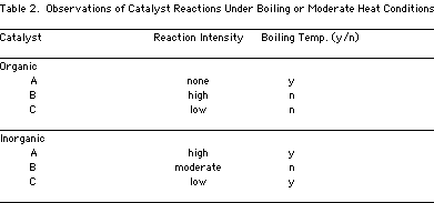
Textual (Word) Tables: Oftentimes, you may need tables that have textual data in the body.
Usually this is the case when you're dealing with qualitative data. These tables serve the same
function as any table--to make comparisons of items easy. These tables are also used when you
want to present examples, which may be grouped in a certain way, or when you want to show
categories of different items.
Example 3 : Text Table
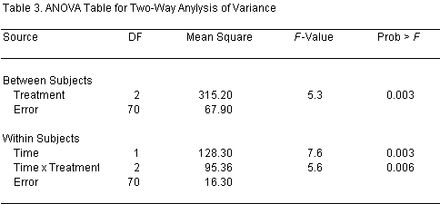
Statistical Tables: These tables can present descriptive or inferential statistics
or both. Descriptive statistics are tabulations such as mean, standard deviation, mode,
range, or frequency. Inferential statistics refers to statistical tests. In such tables,
statistical test values are presented.
Example 4 : Statistical Table
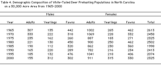
Numerical Tables: These are the most common types of data, which typically represent
quantitative data, but sometimes may present a combination of quantitative and qualitative
data. As its name suggests, most of the body of the table consists of specific number values.
Example 5 : Numerical Table
Return to Top
Best Practice
Best practice in tabular presentation refers to designing tables that can be read easily and
quickly. The faster someone can read a table, the better it is. Remember these two words:
ease and speed! There are ways to accomplish this by manipulating contrast, alignment, spacing
and ordering. All these elements help to achieve clarity so that the reader can pick out
specific data and understand the discussion of your results.
Contrast: By making key elements of your table stand out from one another, you can
group or distinguish data from each other. For example, you could bold the title, dividers,
or headings. You can use different font sizes, styles, or letter cases for different elements
in your table. You can use color to emphasize backgrounds or text. Regardless of which of
these you choose for creating contrast, remember that "less is more" when it comes to creating
an effective table.
Alignment: Alignment is important for keeping your table neat and clear. For example,
all numbers in the columns should line up with each other and with their headings. Structure
your table so that all elements seem to be properly aligned with each other--titles, headings,
data, dividers, notes.
Ordering: Group items that are similar to give a sense of structure and meaning to your
table. This will also help break up the data, making it easier on the eye. Another way to order
data is to indent subordinate data when it falls below specific column data.
Spacing: Manipulating the "white areas" around the table can also help clarify and
organize the table. For example, you should always have enough space around and between text
so that it stands out. You can use space to separate groups or emphasize them.
Example 6 : Best Practice
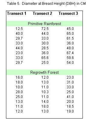
This example shows the use of contrast to set the two types of forests apart. It
also uses bold-faced and varying font sizes to distinguish the column headings
from the table spanners. Spacing beneath the column headings creates additional
contrast. Using a border around the table also makes it stand out more and contains
the data nicely. Notice that all numbers are aligned by decimal place and that all
text is centered. The next example shows this same table without the use of "best practice."
Example 7 : Poor Practice
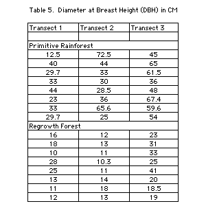
With all the gridlines, lack of contrast, and poor use of space and alignment, this table
is difficult to read.
Example 8 : Best Practice
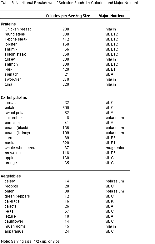
This table makes use of appropriate groupings in order to break the list apart and make
it easy to follow. Good use of space and varying size and bold-faced fonts also create
a nice contrast and make it easy on the eyes. Below is the same table following poor practice.
Example 9 : Poor Practice
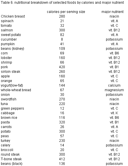
Notice that this table lacks grouping of any kind, making it difficult to sort through the list.
Title and header formatting is not consistent throughout, and the numerical data is centered instead
of left-aligned, making it difficult to compare values. There is no contrast or use of space, so this
table is a lot less easy on the eyes than the one above.
Return to Top
Works Consulted
Birchman, J. S., A. (2003). Enhancing the appearance of information graphics.
Engineering Design Graphics
Journal, 67(1), 17.
Hall, R. O. (1943). Handbook of Tabular Presentation. New York: The Ronald Press
Company.
Nicol, A. A. M. P. & Pexman, M. P. (1999). Presenting Your Findings: A Practical Guide
for Creating Tables.
Washington, DC: American Psychological Association.
Wainer, H. (1992). Understanding graphs and tables. Educational Researcher, 21, 14-23.
Wright, P. (1977). Presenting technical information: A survey of research findings.
Instructional Science,
6, 93-134.
| |


