Selecting Data to Display
Table of Contents
- Removing outlier data values
- Restricting the range of an axis scale
- Revising the data source range
Introduction
When you graph a data set, decisions often have to be made as to exactly
which data points should be displayed in the graph. If you decide not
to show all of your data, you should have a good reason for removing selected
values. You should also make sure the reader of your report also knows
that data has been removed. Below are some examples of when you might
want to selectively remove/display (cull), data points.
Removing outlier data values
Below is a graph of a data set of more than 1600 points depicting the
tensile strength of 1100 aluminum:
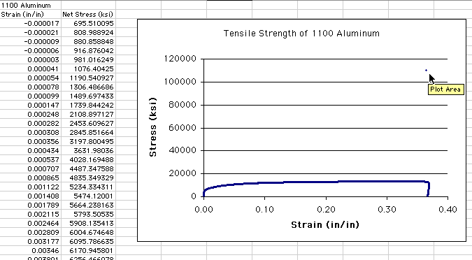
Notice that a vast majority of the data points are compressed at the
bottom of the graph between 0 and 20000 psi. Excel, by default, will set
the scale for the vertical axis for a range determined by the range of
the data. The vertical scale of the graph ranges from 0 to 120000 because
there is a single point near the top of the range. This point, an outlier,
is being pointed at by the cursor in the figure. The value of this outlier,
approximately 110000, is nearly an order of magnitude larger than any
other point in the graph and is clearly a measurement error. Given the
degree of difference to the next largest point and the total number of
points remaining, you can safely remove it from the data set. You should
clearly define the rules you use to remove data points and indicate that
you have done so in your Results section.
How do you find and remove this point? You could look through all 1600
rows for the obviously large value, but this will take a lot of time.
An easier approach is to sort the columns of data. By default,
data is usually sorted by the independent variable in ascending order
(Column A in this example). What you need to do is to sort by the dependent
variable in Column B so that the outlier 'sinks to the bottom' of the
data set.
Highlight Columns A and B by boxing in all
of the cells holding data (Note: it is critical to highlight both
columns, so that the data pairs in each row stay together). Now choose
the command Data>Sort...
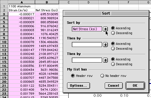
You need to sort by the dependent variable, Net Stress, in Column B.
Notice in the dialogue box that it was smart enough to recognize that
there were column header labels above the data and to give these as options
in the drop down menu box that is highlighted in the figure. If it does
not recognize headers, it will give you a list of Columns you can sort
by. Since you want the large outlier to sink to the bottom of the list,
choose to sort by Ascending order. After you press OK, the data
set will be sorted, and the outlier will appear at the bottom of the list:
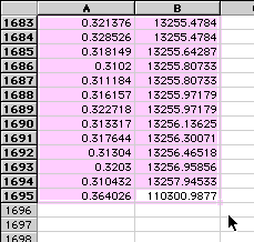
At this point, you can delete the row with the bad point (Row 1695).
With the row deleted, your graph should now update:
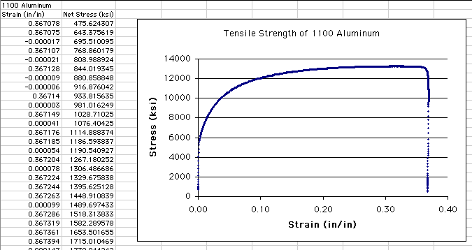
Now the vertical axis automatically updates to reflect the new range
of the data, more clearly showing the shape of the data distribution.
Return to Top
Restricting the range of an axis scale
Looking at the last graph, it is clear that the stress values drop off
sharply at the upper strain limit. It is at this point that the final
failure of the metal sample occurs. If you are not interested in depicting
this final failure, you may want to limit the graph display to strain
values below 0.30. You could do this by deleting the data points with
strain values above 0.30, but you may need this data later on. In this
case, the data is not 'bad' like the outlier was, it just simply isn't
of interest right now.
An alternative is to restrict the range of an axis scale. By default,
Excel will automatically update an axis scale to represent the full range
of the data set, as seen in the above example. You can, however, manually
restrict this range. To do so, double-click on an axis value
(in this case, the X-axis value):
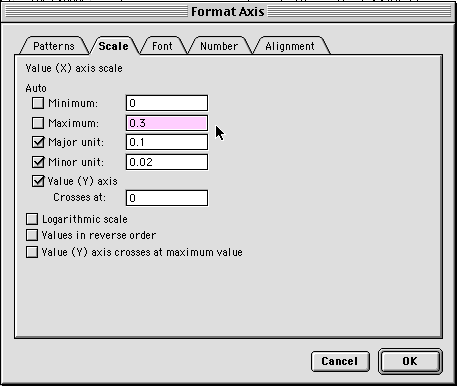
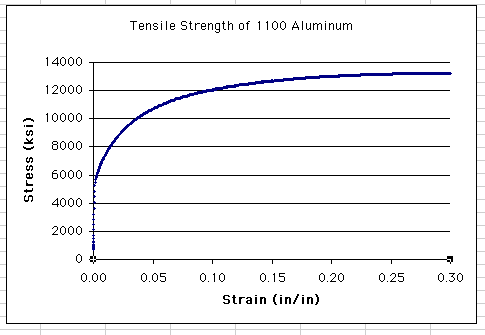
Type in a new value for Maximum. Notice that the Auto
check box automatically goes off. In this case, you'll limit the
maximum value to 0.30. The resulting graph will look like this:
Return to Top
Revising the data source range
Another method for selectively displaying data without deleting data
points is to interactively revise the data source range. Suppose you wanted
to focus in on the slope of the initial rise in stress values. It is hard
to know exactly what the appropriate X-axis range would be, but you can
interactively adjust it. Start by clicking once on the data
series (i.e., the blue data points) to highlight the data series
in the graph and in the columns:
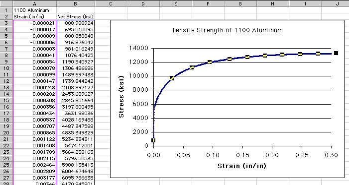
Notice that when the data series in the graph is highlighted, a magenta
box surrounds the independent variable values in Column A and a blue box
surrounds the dependent variable values in Column B. What can't be seen
in this figure is that at the bottom of the magenta and blue boxes are
small square handles that can be used to resize the boxes.
Since there are so many points in this data set, the easiest way to initially
restrict the range of points to be displayed is to reset the range through
a dialogue box. With the graph highlighted, choose Graph>Source
Data:
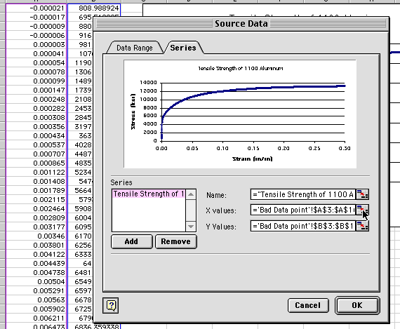
Under the Series tab, click on what looks like a miniature
spreadsheet icon to the right of the X values box. This will allow
you to interactively select a new range of X (independent variable, Strain)
values. Click and drag a new range in Column A, in this case a
guess is made to display up to a strain value of 0.03:
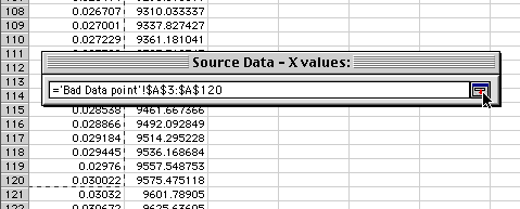
Note what row you picked to and then click on the spreadsheet
icon in the floating palette. Repeat this process for the Y(dependent
variable, stress) values, dragging up to the same row number as you did
for the X values. With the new range selected for the variables, your
new graph will look like:
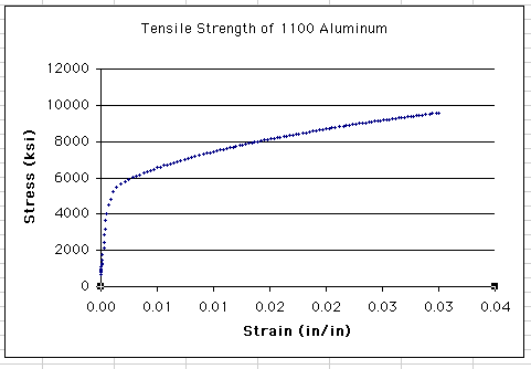
Note: if the X or Y axis scale does not update, double-click on
one of the axis values and make sure the Axis Minimum and Maximum
values are set to Auto.
It looks as though you are beginning to home in on the initial linear
section of the graph, but you are not there yet. Since the data range
is much more limited now (only about 115 points), highlight the
data series and click and drag the square handles at
the bottom of the magenta and blue boxes surrounding the data values.
Reduce the boxes so they just encompass the initial linear section of
the graph; your graph will interactively update as you do this:
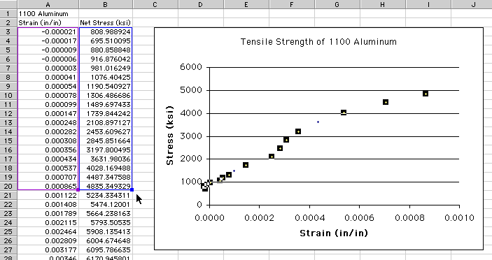
Notice that you have just a few (i.e., 18) data points selected, down
from the original 1600. You haven't deleted any of these other points,
but you are only selectively displaying those of most interest. With this
graph, you can now clearly focus in on the initial rise in Stress.
Note that you can also move the magenta and blue boxes down to select
a intermediate range of data points by clicking and dragging on
any part of the box other than the square handle at the
bottom.
Return to Top
| 


