Superimposing Graphs
Table of Contents
- Superimposing graphs
- Reformatting the new graph
Introduction
If you want to merge data from two graphs, rather than create a new graph
from scratch, you can superimpose the two using a simple 'copy
and paste' operation. Before superimposing two graphs, consider the following:
- Do the two graphs share the same independent variable (the X axis)?
If not, you should not try to merge them.
- Do the two graphs share the same dependent variable (the Y axis)?
If not, you should not try to merge them.
- What is the relationship of the data in the two graphs? Normally you
will be creating a second independent variable when you superimpose
the graphs. For example, they might be two levels of a common variable.
In the example below, the two graphs represent two different types of
aluminum alloy.
- Do the two graphs share the same variable scales and a similar range
of values? For example, if the first graph has dependent variable values
running from 0.1 and 2.5 seconds and the second graph between 250 and
3500 seconds, the scale of the superimposed graph, in order to show
the second's values, will make it very difficult to see the values of
the first.
Superimposing graphs
Below is a graph of the tensile strength of one type of aluminum:
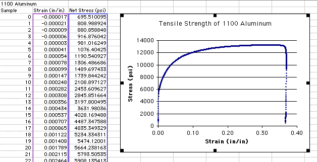
The graph has been selected by clicking just inside the outer box of
the graph. Notice that when the graph is selected, black boxes (or 'handles')
show around the perimeter. With the graph selected, you can also see the
independent (Strain) and dependent (Stress) data highlighted to the left
in purple and blue, respectively. Because the graph only has one independent
variable, there is no need to have a legend. Information about what the
independent and dependent variables relate to is in the title.
In this example, both the first and the second graph and their data are
on the same worksheet page:
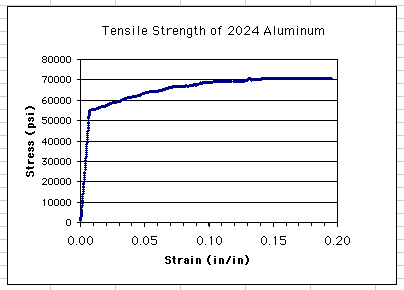
Notice that the independent and dependent variables are identical, though
the ranges of the scales are slightly different. The second graph has
Stress values ranging up to approximately 70000 psi, compared to 13500
psi on the first graph. The second graph has Strain values only up to
approximately 0.20 in/in compared to 0.38 in/in on the first.
To superimpose the two graphs, you should first create a copy of one
of the graphs to use as a base for the new graph. You want a copy in case
something happens during the superimposition process. To copy the graph:
- Select the first graph (1100 Aluminum in this case) by clicking somewhere
just inside the outer box (the back box handles will appear around the
perimeter).
- Choose Edit>Copy from the menu.
- Click in a new spreadsheet cell that represents, approximately, the
upper left hand corner of where you want the new graph to go.
- Choose Edit>Paste from the menu.
This new copy will be used as the base for the superimposed graph. Now
select the second graph to begin the superimposition process:
- Select the second graph (e.g., 2024 Aluminum) so the handles appear.
- Choose Edit>Copy from the menu.
- Click on the copy of first graph (e.g., 1100 Aluminum) so the handles
appear.This is a critical step since it indicates the target of where
the second graph is to be copied.
- Choose Edit>Paste from the menu.
The new, superimposed graph should now show both sets of data:
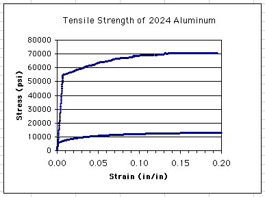
Notice that it has taken the title from the second graph (2024 Aluminum).
Also noticed that while the dependent variable scale (Stress) adjusted
to accommodate the larger range of the second graph, the independent variable
scale clipped the larger range of the first graph.
Return to Top
Reformatting the new graph
You can adjust the range of the scales by selecting the new graph and
double-clicking on an axis value:
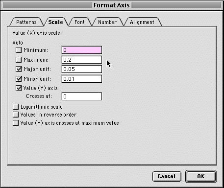
Choose the Scale tab and set the scale range and units as needed.
At present, both of the data series are using the same color and symbol.
This can be changed by double-clicking on one of the data points
on the graph:
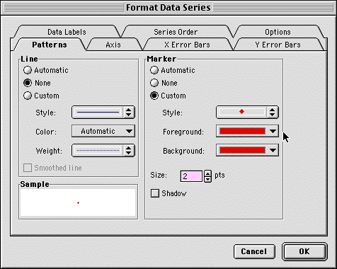
You can now select the Patterns tab and choose a new Style,
Foreground, and Background for the Markers of the data series.
Because you have two independent variables in the new graph, you will
also want to show the legend. You can do this by selecting the graph and
choosing Chart>Chart Options..., selecting the Legends
tab, and clicking the Show Legend check box.
If the text in the legend does not properly reflect the second independent
variable levels, you will need to change this by selecting the graph and
going to Chart>Source Data...
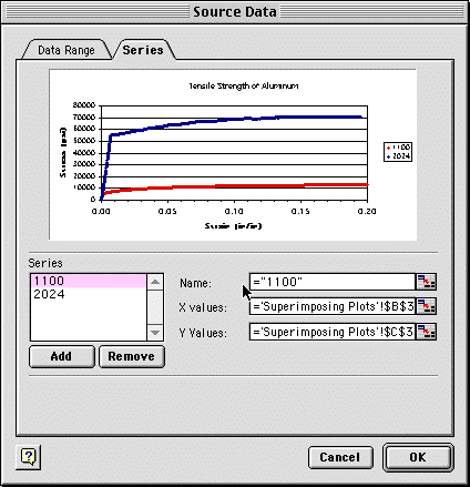
- Select the Series tab.
- Now select the Series whose name needs to be changed.
- Type a new name in the Name: field. This can be in the form
seen above or by simply typing the name (without quotes) into the box.
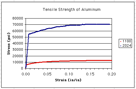
The title on the graph can be changed by clicking once on the
title and highlighting the text you want to change. The
final graph in our example looks like this:
Return to Top
| 


