When you are ready to integrate your graphs or other graphics
into your lab report, you should go back and make a final check that
your graphic will properly convey the necessary information to the reader.
Assuming that you have chosen the proper graph type to display your
data, most of these final adjustments concern the labeling and display
of your variable axes and your title. Some things to consider:
- Have you labeled each axis with the variable? Spell out the name or
use standard abbreviations.
- Have you shown a legend? A legend is needed if you have coded a second
independent variable with color, pattern, or shape. You do not need
a legend if you have a single independent variable.
- Have you put the units of measurement in parentheses after the variable?
Again, only use standard abbreviations.
- Are scale values labeled on the axis? Make sure the labels are adequately
spaced. Label every other tick mark if they are too crowded.
- Do the axes and graph region have an appropriate density of tick marks
and grid lines? Generally speaking, less is better. Readers are not
usually expected to be able to read individual values from a graph.
- Is the text in the graph an appropriate size for the final presentation
of the graph? The graph may need to be placed in the document and printed
out to test this.
- Does the graph have an appropriately descriptive title? Simply listing
the variables is usually not adequate. Conversely, the title does not
have to be a full sentence.
- When placed in the document, graphs simply have the figure number
put below the graphic (e.g., Figure 5). No caption is needed since
the graph has a title. If you are using a photo or other graphic, a
caption title may be needed. Tables are labeled on top, including a
title (e.g., Table 2. Histogram of Glass Rod Strengths (25 psi bins).
Examples:
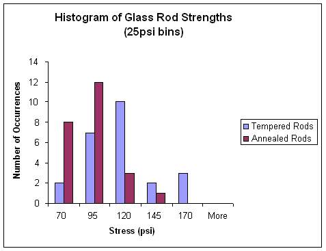
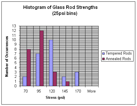
Figure 1.
Figure 1 will be considered our optimal graph example.
Notice the labeling of the variables and axes and the appropriate title.
Also notice the comfortably spaced tick marks and the absence of grid
lines (you don't need them in this graph to read the values of the bars).
Table 1. Histogram of Glass Rod Strengths (25 psi bins)
|
| |
No. of Occurrences
|
|
Stress (psi)
|
Annealed
|
Tempered
|
|
|
70
|
|
8
|
|
2
|
|
|
95
|
|
12
|
|
7
|
|
|
120
|
|
3
|
|
10
|
|
|
145
|
|
1
|
|
2
|
|
|
170
|
|
0
|
|
3
|
|
|
More
|
|
0
|
|
0
|
|
Table 1 will be considered our optimal table example.
Notice that the table has its label and titling at the top of the table.
As with a graph, the variables need to be appropriately labeled. Note
that the variable labels are in a slightly larger font, bolded, and
separated from the data by a horizontal rule. Labels can be center
justified, but the data should be right justified under the variable
labels. If your numbers have an uneven number of decimal places, the
special tab stop for decimals can be used.
Figure 2.
The grid lines in Figure 2 are distracting, without adding
anything to the interpretation of the graph. Also notice that scale
labeling is too dense on the vertical axis, making it difficult to read.
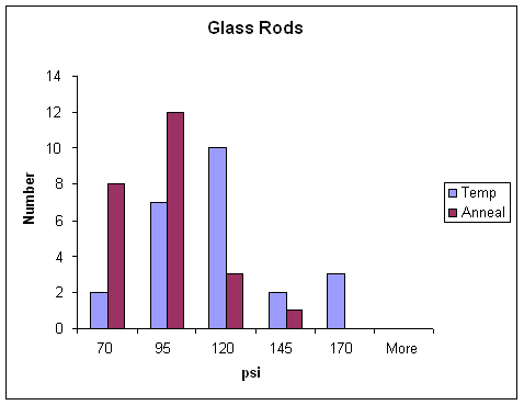
Figure 3.
In Figure 3, all of the labeling is too terse. The title
indicates that the graph has something to do with glass rods, but we
don't know what. The horizontal axis gives the units but not the variable
name. The vertical axis does not clearly indicate that it is the number
of occurrences. Notice the use of non-standard abbreviations in the
legend. The 'temp' abbreviation could easily be mistaken for 'temperature'
rather than 'tempered'.
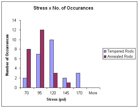
Figure 4.
Figure 4 has an equally inappropriate title. The
independent and dependent variables are duplicated in the title without
giving us any background of what these variables are related to (i.e.,
glass rod strength). Also notice the misspelling in the title. Excel
will not spell-check your titles and labeling, so double-check!
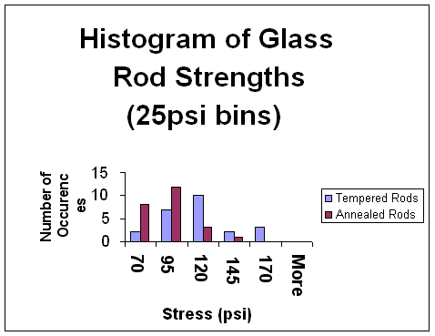
Figure 5a.
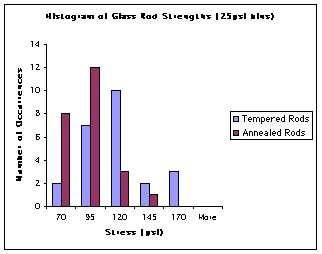
Figure 5b.
Figures 5 shows examples of too large and too small text.
The too large text in Figure 5a ends up crowding out the most important
part of the graphic, the graph, without adding anything to the readability
of the graphic. Also notice that too large text begins to create problems
with words breaking across lines. The smaller text in Figure 5b provides
more room for the graph and nice spacing for the scale labels, but it
will be difficult to read. Though the small text may be marginally
acceptable on a high resolution laser printer, it will be hard to read
off ink-jet printers and on the screen. Try to keep all text at least
9-10 points in size.