Basic Graphing in Excel
Table of Contents
- Entering and Formatting the Data in Excel
- Creating the Initial Scatter Plot
- Creating a Scatter Plot of Titration Data
- Changing the Scatter Plot to a Line Graph
Introduction
Beer's Law states that there is a linear relationship between concentration
of a colored compound in solution and the light absorption of the solution.
This fact can be used to calculate the concentration of unknown solutions,
given their absorption readings. First, a series of solutions of known
concentration are tested for their absorption level. Next, a scatter plot
is made of this empirical data.
Entering and Formatting the Data in Excel
Open Excel and begin by formatting the spreadsheet
cells so the appropriate number of decimal places are displayed (see
Figure 1a).
- Click and drag over the range of cells that will hold the concentration
data (A5 through A10 for the sample data)
- Choose Format > Cells... (this is shorthand for choosing
Cells... from the Format menu at the top of the Excel window)
- Click on the Number tab
- Under Category choose Number and set Decimal places to 5
- Click OK
- Repeat for the absorbance data column (B5 through B10 for the sample
data), setting the decimal places to 4
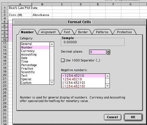
Figure 1a.
Your data will go in the first two columns in
the spreadsheet. Type what is seen in Figure 1b in
the appropriate cells.
- Title the spreadsheet page in cell A1
- Label Column A as the Concentration (M)
of the known solutions in cell A3. This is the independent
variable
- Label Column B as the Absorbance readings
for each of the solutions in cell B3. This is the dependent
variable
- Enter the independent and dependent variable values
- Finally, enter the information shown in rows
12 and 13. These are absorbance values from
two samples of unknown concentrations (more on this later).
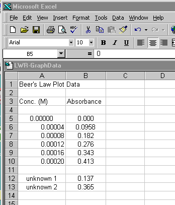
Figure 1b.
The concentration data is probably better expressed in scientific notation.
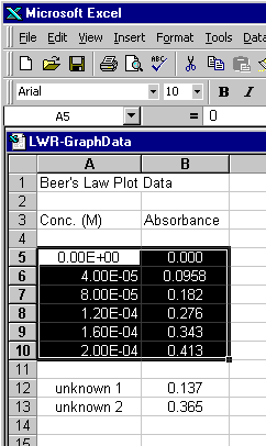
Figure 2.
Return to Top
Creating the Initial Scatter Plot
With the data you want graphed highlighted, start the chart wizard
- Choose the Chart Wizard icon from the tool bar (see Figure
3 for two examples). If the Chart Wizard is not visible, you can also
choose Insert > Chart...
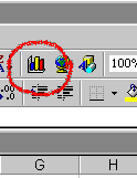
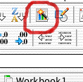
Figure 3.
The first dialogue of the wizard comes up
- Choose XY (Scatter) and the unconnected points icon
for the Chart sub-type (Figure 4a)
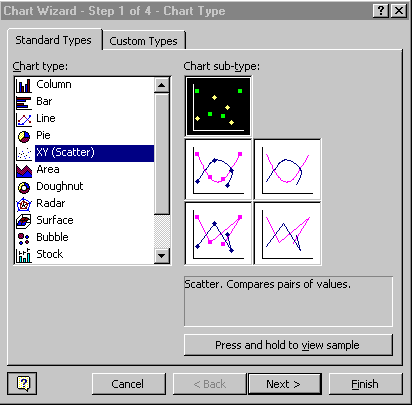
Figure 4a.
Return to Top
The Data Range box should reflect the data you highlighted in the spreadsheet.
The Series option should be set to Columns, which is how your data is
organized (see Figure 4b).
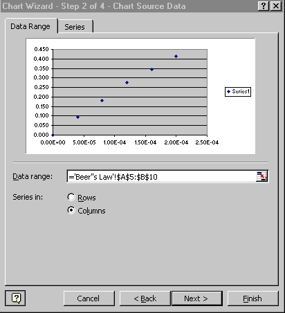
Figure 4b.
The next dialogue in the wizard is where you label your chart (Figure
4c)
- Enter Beer's Law for the Chart Title
- Enter Concentration (M) for the Value X Axis
- Enter Absorbance for the Value Y Axis
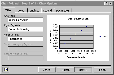
Figure 4c.
- Click on the Legend tab
- Click off the Show Legend option (Figure 4d)
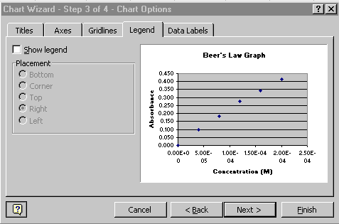
Figure 4d.
Return to Top
Keep the chart as object in Sheet 1
(the current sheet). See Figure 4e.
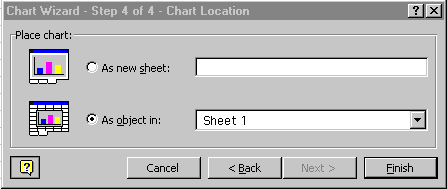
Figure 4e.
The initial scatter plot is now finished and should
appear on the same spreadsheet page (called a sheet) as your original
data. Your chart should look like Figure 5. A few items of note:
- Your data should look as though it falls along a linear path
- Horizontal reference lines were automatically placed in your chart,
along with a gray background
- Your chart is highlighted with square 'handles' on the corners. When
your chart is highlighted, a special Chart floating palette should also
appear, as is seen in Figure 5. Note: If the Chart floating palette
does not appear, go to Tools>Customize..., click on the Toolbars
tab, and then click on the Chart checkbox. If it still doesn't
show up as a floating palette, it may be 'docked' on one of your tool
bars at the top of the Excel window.
With your graph highlighted, you can click and drag the chart to
a wherever you would like it located on the spreadsheet page. Grabbing
one of the four corner handles allows you to resize the graph.
Note: the graph will automatically adjust a number of chart properties
as you resize the graph, including the font size of the text in the
graph. You may need to go back and alter these properties. At the
end of the first part of this tutorial, you will learn how to do this.
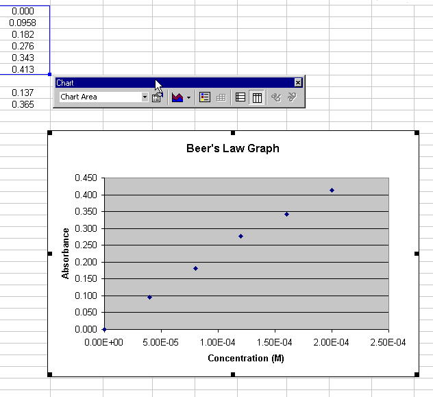
Figure 5.
Go to the tutorial on creating
regression lines to find out how to use a regression line with this
scatter plot to calculate the concentrations of the two unknowns.
Return to Top
Creating an Initial Scatter Plot of Titration Data
In this next part of the tutorial, we will work
with another set of data. In this case, it is of a strong acid-strong
base titration (see Figure 10 for the final plot). With this titration,
a strong base (NaOH) of known concentration is added to a strong acid
(also of known concentration, in this case). As the strong base is added
to solution, its OH- ions bind with the free H+ions of the acid. An
equivalence point is reached when there are no free OH- nor H+ ions
in the solution. This equivalence point can be found with a color indicator
in the solution or through a pH titration curve. This part of the tutorial
will show you how to do the latter.
Note that there should be two columns of data in your spreadsheet:
Column A: mL of 0.1 M NaOH added
Column B: pH of the 0.1 M HCl / 0.1M NaOH mixture
- Using a new sheet in the spreadsheet workbook, enter your titration
data as shown in Figure 6.
- Go to the Data Input Tutorial
if you need hints on formatting the cells to the proper number of decimal
places
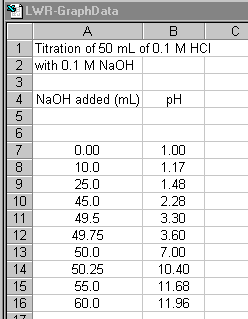
Figure 6.
Now, create a scatter plot of titration data,
just as you did with the Beer's Law plot (Figure
7).
- Highlight the titration data and the Column headers
- Click on the Chart wizard icon
- Choose XY (Scatter) and the Scatter Chart sub-type
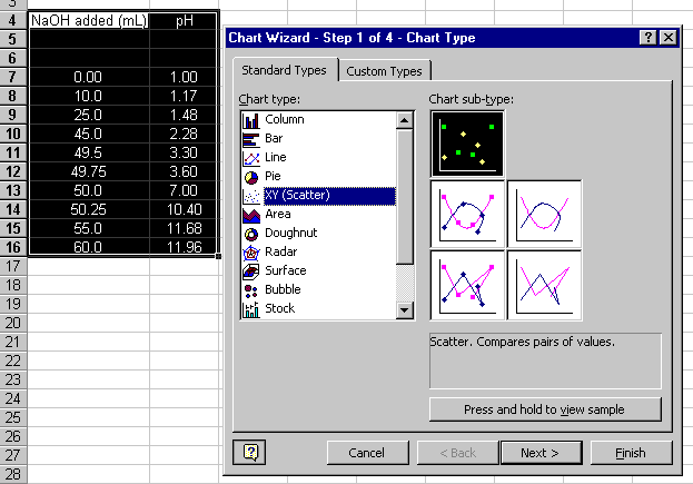
Figure 7.
Continue through steps 2 through 4 of the Chart wizard:
- The defaults for step 2 should be fine if you properly highlighted
the data
- In step 3 enter the chart Title and x and y axis Labels
and turn Off the Legend
- In step 4, leave as an object in the current page
The resulting plot should look like Figure 8:
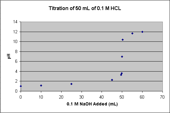
Figure 8.
Return to Top
Changing the Scatter Plot to a Line Graph
All of the points of the titration data can be
connected to form a smooth curve. With this approach, the curve is guaranteed
to go through all of the data points. This option can be used if you
have only one pH reading per amount of NaOH added. If you have
multiple pH readings for each amount added on the scatter plot, you
will not end up with a smooth curve. To change the scatter plot to a
(smoothed) line graph (Figure 9):
- Choose Chart > Chart Type...
- Select the Scatter connected by smooth lines Chart subtype
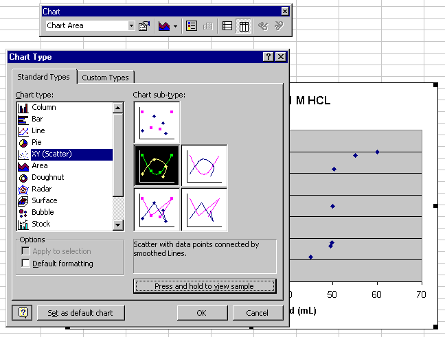
Figure 9.
The result should look like Figure 10:
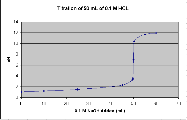
Figure 10.
This smooth, connected curve helps locate where the steep part of the
curve passes through pH 7.
Return to Top
|